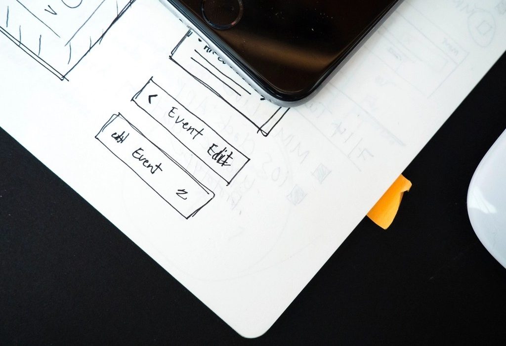
A prototype lets people use your design before anything is built. In the wireframing lesson you drew static screens; now you will connect them so a tester can tap through a task. Prototyping in Figma happens in the same file as your design, so you do not need a separate app.
Why prototype?
- To test a flow with users before developers spend time building it.
- To show stakeholders how something behaves, not just how it looks.
- To explain interactions to developers more clearly than written notes.
- To find missing screens – you notice quickly when a button leads nowhere.
Tip: Match the fidelity to your question. To test whether people can find the seat-selection step, grey wireframes are enough. To test whether a new animation feels clear, you need high fidelity.
The parts of a Figma interaction
Switch to the Prototype tab in the right sidebar. Select a layer, such as a button, and drag the small circular handle to the destination frame. This creates a connection (sometimes called a noodle). Each connection has three settings:
| Setting | What it decides | Common choices |
|---|---|---|
| Trigger | What the user does | On click/tap, On drag, While hovering, While pressing, Mouse enter, Key/Gamepad, After delay |
| Action | What happens | Navigate to, Back, Scroll to, Open overlay, Close overlay, Swap overlay, Change to, Open link, Set variable |
| Animation | How it moves | Instant, Dissolve, Smart animate, Move in/out, Push, Slide in/out |
Prototyping in Figma, step by step: a bus booking flow
- Arrange your frames left to right: Search › Results › Seat selection › Passenger details › Payment › Confirmation.
- On the Search frame, connect the “Search buses” button to Results with On tap › Navigate to and a Push left animation, which feels like moving forward.
- Connect each result card’s “View seats” button to Seat selection.
- Add a back arrow on each screen with the Back action, so testers can recover from mistakes.
- For the boarding-point picker, build it as a separate frame and use Open overlay positioned at the bottom, with a background dim. Add Close overlay to its close button.
- On the first frame, check that a flow starting point exists (Figma creates one with your first connection). Rename it “Book a bus ticket”.
- Press the Present (play) button to try it. To test on a real phone, open the file in the Figma mobile app.
Smart Animate
Smart animate looks for layers with the same name in both frames and animates the differences in position, size, rotation, opacity and fill. It is useful for things like a card expanding into a details view or a bottom sheet sliding up. The key rule is naming: if the layer is called “Fare” in one frame and “Price” in the other, Figma cannot match them and will simply fade between the two frames.
Interactive components
Instead of making a new frame for every button state, add interactions directly to component variants. For example, create a seat component with variants Available, Selected and Booked. On the Available variant, add On tap › Change to › Selected. Every instance of the seat in your prototype now toggles on its own, which saves dozens of frames.
Variables and conditional logic
Figma Variables can hold colours, numbers, text and true/false values, and prototypes can change them. You might create a number variable seatsSelected, use Set variable to add 1 on each tap, and show it in a “2 seats selected” label. A Conditional action can then check it – for instance, only enable Continue when the value is above 0. Variables with modes also let you preview light and dark themes in the same prototype.
Watch out: Do not over-build. A prototype for a usability test needs only the screens and paths for the tasks you are testing. Wiring every possible link makes the file slow and hard to maintain.
Sharing and hand-off
Share the prototype link (view access is enough to play it) for testing or reviews. Comments can be added right on the prototype. When the design is approved, developers use Dev Mode to inspect spacing, colours and component properties, and to see which frames are marked ready for development.
Before testing with users, though, the screens need a clear visual order. That is the topic of the next lesson on visual hierarchy, and we return to this prototype in usability testing.
Further reading
- help.figma.com/hc/en-us/articles/360040314193-Guide-to-prototyping-in-Figma
- help.figma.com/hc/en-us/articles/360039818874-Create-advanced-animations-with-smart-animate
- help.figma.com/hc/en-us/articles/360056440594-Create-and-use-variants
- help.figma.com/hc/en-us/articles/15339657135383-Guide-to-variables-in-Figma
- help.figma.com/hc/en-us/articles/15023124644247-Guide-to-Dev-Mode