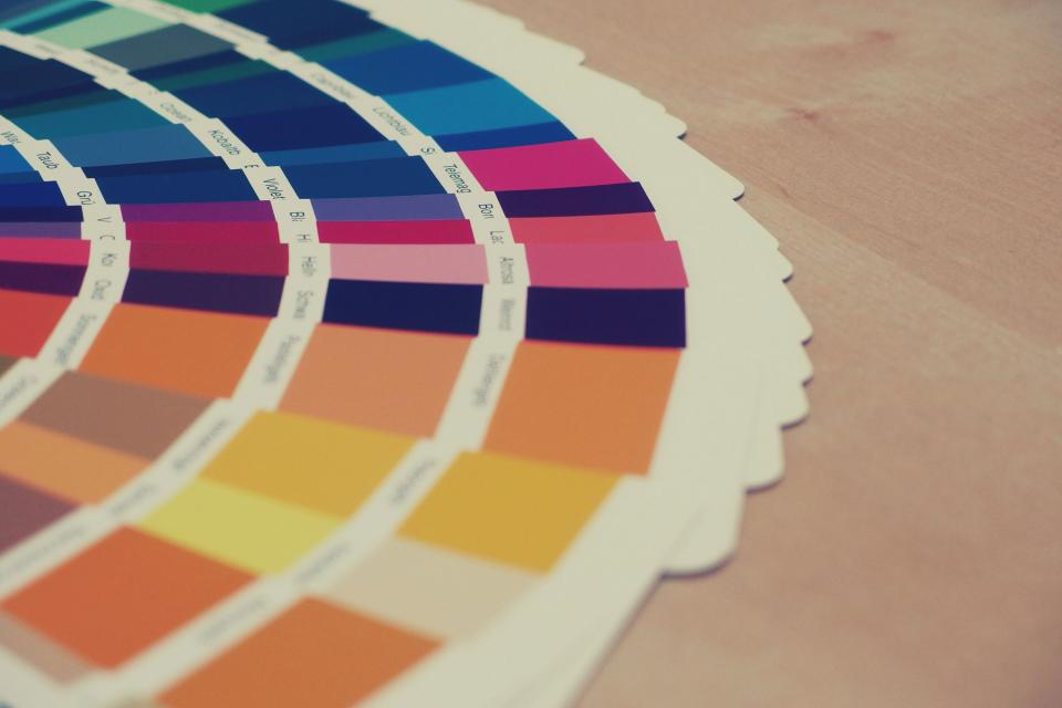
Colour in UI design sets mood and brand, but its main jobs are practical: guiding attention, showing state and making text readable. The visual hierarchy lesson showed colour as a tool for emphasis. Here you will learn to build a palette with clear roles and to check it against accessibility rules.
Give every colour a role
A UI palette is not a list of favourite shades. Each colour should have a job. A small, typical set looks like this:
| Role | Used for | Notes |
|---|---|---|
| Primary | Main buttons, active tabs, key links | Usually the brand colour; use it sparingly so it stays meaningful |
| Neutrals | Text, backgrounds, borders, dividers | A range of greys (often 8–10 steps) does most of the work |
| Success | Confirmations, completed states | Often green |
| Warning | Things that need attention soon | Often amber or orange |
| Error | Failed actions, invalid fields | Often red |
| Info | Neutral messages, tips | Often blue |
A popular rule of thumb is 60-30-10: roughly 60% neutral background, 30% secondary surfaces and 10% accent. It is a starting point, not a law, but it reminds you that bright brand colour works best in small amounts.
Contrast: the WCAG 2.2 rules
The Web Content Accessibility Guidelines (WCAG) 2.2 set minimum contrast ratios so that people with low vision, older users and anyone using a phone in bright sunlight can read your screens. At Level AA, which most organisations target:
| What | Minimum ratio (AA) | Success criterion |
|---|---|---|
| Normal body text | 4.5 : 1 | 1.4.3 Contrast (Minimum) |
| Large text – at least 18 pt (about 24 px), or 14 pt (about 18.66 px) bold | 3 : 1 | 1.4.3 Contrast (Minimum) |
| UI components and meaningful graphics – input borders, icons, focus rings, chart lines | 3 : 1 against adjacent colours | 1.4.11 Non-text Contrast |
The stricter AAA level asks for 7:1 for normal text and 4.5:1 for large text. Some reference points on a white background: #767676 grey gives about 4.5:1 and just passes for body text; #999999 gives about 2.8:1 and fails; #595959 gives 7:1. White text on a mid orange such as #FF9800 is only about 2.2:1, while dark text on the same orange is about 8:1.
Tip: Figma has contrast-checking plugins, and many colour pickers show the ratio. Check text, placeholder text, disabled-looking-but-still-important text and input borders – these are where most failures happen.
Watch out: Do not use colour as the only way to show meaning (WCAG 1.4.1 Use of Colour). A red border alone on a form field is invisible to many colour-blind users. Add an icon and a text message such as “Enter a 10-digit mobile number”. The same goes for charts and seat maps: combine colour with labels, patterns or shapes.
Building a palette step by step
- Start with one primary colour that fits the brand and the audience.
- Generate a range of tints and shades for it (for example, 50 to 900), so you have light backgrounds and dark text versions.
- Create a neutral grey scale. Slightly warm or cool greys can harmonise with the primary colour.
- Add success, warning, error and info colours, each with a light background shade and a darker text shade.
- Test key pairs for contrast and adjust until text pairs reach 4.5:1 and component pairs reach 3:1.
- Check with a colour-blindness simulator; Figma and browser developer tools offer these.
Organising colour with Figma Variables
In Figma, store colours as Variables in two layers. Primitive variables hold raw values, such as blue/600. Semantic variables describe purpose, such as text/primary, surface/default or button/primary/bg, and point to a primitive. Add modes called Light and Dark: the semantic variable surface/default can point to white in Light mode and near-black in Dark mode. Switching a frame’s mode then updates every colour at once.
This maps directly to code: semantic variables become CSS custom properties, and the developer can read them in Dev Mode. The CSS colours lesson shows the colour formats developers will use.
Cultural meaning of colour in UI design
Colour meanings vary. In India, saffron, green and red carry strong cultural and religious associations, and red can mean celebration as well as danger. For status colours, rely on widely understood conventions plus icons and text, and do not let decorative colour clash with error or success colours.
For a deeper look at colour harmony and colour wheels, read Colour theory for UI designers. Next we cover the other half of readability: typography.