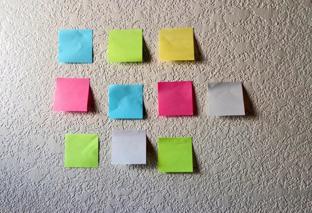
CSS Grid is a layout system for two dimensions: rows and columns at the same time. Where Flexbox lines items up in a single row or column, Grid lets you design the whole structure first and then place content into it. Page layouts, image galleries, product listings and dashboards all become short, readable CSS.
Creating a grid
Add display: grid to a parent to make it a grid container; its direct children become grid items. On its own that just stacks items in one column. The layout appears when you define columns with grid-template-columns and, if needed, rows with grid-template-rows.
The fr unit means “a fraction of the free space”. grid-template-columns: 1fr 2fr creates two columns where the second is twice as wide as the first. Because fractions are calculated after fixed sizes and gaps, you never need to do percentage maths for gutters.
<!DOCTYPE html>
<html lang="en">
<head>
<meta charset="utf-8">
<meta name="viewport" content="width=device-width, initial-scale=1">
<title>Three equal columns with gap</title>
<style>
body { font-family: system-ui, sans-serif; padding: 20px; }

.grid {
  display: grid;
  grid-template-columns: repeat(3, 1fr);
  gap: 16px;
}

.grid > div {
  background: #e3fafc;
  border: 1px solid #66d9e8;
  padding: 20px;
  border-radius: 8px;
  text-align: center;
}
</style>
</head>
<body>
<div class="grid">
  <div>Chennai</div><div>Bengaluru</div><div>Hyderabad</div>
  <div>Kochi</div><div>Mysuru</div><div>Madurai</div>
</div>
</body>
</html>
Key grid properties and functions
| Feature | Example | Meaning |
|---|---|---|
grid-template-columns | 200px 1fr | A fixed sidebar and a flexible main column |
repeat() | repeat(4, 1fr) | Shorthand for repeating a track size |
minmax() | minmax(200px, 1fr) | A track that never goes below 200px |
auto-fit | repeat(auto-fit, minmax(200px, 1fr)) | As many columns as fit; the rest wrap |
gap | gap: 24px 16px | Row gap, then column gap |
grid-column | span 2 or 1 / -1 | How many columns an item covers |
A responsive grid without media queries
One line of CSS Grid creates a fully responsive card layout: grid-template-columns: repeat(auto-fit, minmax(220px, 1fr)). Read it as “fit as many columns as possible, each at least 220px wide, and share the leftover space equally”. On a phone you get one column, on a tablet two or three, on a desktop four or more, all without a single breakpoint.
<!DOCTYPE html>
<html lang="en">
<head>
<meta charset="utf-8">
<meta name="viewport" content="width=device-width, initial-scale=1">
<title>auto-fit product grid</title>
<style>
*, *::before, *::after { box-sizing: border-box; }
body { font-family: system-ui, sans-serif; padding: 20px; }

.products {
  display: grid;
  grid-template-columns: repeat(auto-fit, minmax(min(100%, 180px), 1fr));
  gap: 16px;
}

.product {
  border: 1px solid #dee2e6;
  border-radius: 10px;
  padding: 16px;
}

.product .img {
  aspect-ratio: 4 / 3;
  background: #ffe066;
  border-radius: 6px;
  margin-block-end: 8px;
}

.featured { background: #fff9db; }

/* only span two columns when there is room for two */
@media (width >= 480px) {
  .featured { grid-column: span 2; }
}
</style>
</head>
<body>
<div class="products">
  <div class="product featured"><div class="img"></div>Festival hamper (featured)</div>
  <div class="product"><div class="img"></div>Mango pickle</div>
  <div class="product"><div class="img"></div>Banana chips</div>
  <div class="product"><div class="img"></div>Murukku</div>
  <div class="product"><div class="img"></div>Coconut oil</div>
</div>
</body>
</html>
The min(100%, 180px) inside minmax() is a small safety net: on a very narrow screen, the minimum becomes the full width instead of forcing a 180px column that overflows. You will meet min() again in CSS Units.
Tip: auto-fit and auto-fill differ only when there are fewer items than would fill a row. auto-fit collapses empty tracks so items stretch to fill the row; auto-fill keeps the empty tracks, so items stay at their minimum size.
Placing items with grid lines
Grid lines are numbered from 1 at the start edge. grid-column: 1 / 3 means “start at line 1 and end at line 3”, covering two columns. Negative numbers count from the end, so grid-column: 1 / -1 stretches an item across every column, which is perfect for a full-width heading inside a grid. span 2 simply means “cover two tracks from wherever you land”.
Named areas for page layouts
grid-template-areas lets you draw your layout with words. Each string is a row and each word is a cell. Then you assign items to areas with grid-area. It reads almost like a sketch of the page, and rearranging the layout for mobile means rewriting a few strings.
<!DOCTYPE html>
<html lang="en">
<head>
<meta charset="utf-8">
<meta name="viewport" content="width=device-width, initial-scale=1">
<title>Page layout with grid-template-areas</title>
<style>
body { font-family: system-ui, sans-serif; margin: 0; }

.page {
  display: grid;
  min-height: 100vh;
  grid-template-columns: 200px 1fr;
  grid-template-rows: auto 1fr auto;
  grid-template-areas:
    "header header"
    "sidebar main"
    "footer footer";
  gap: 8px;
}

header  { grid-area: header;  background: #343a40; color: white; }
aside   { grid-area: sidebar; background: #e9ecef; }
main    { grid-area: main; }
footer  { grid-area: footer;  background: #f8f9fa; }

header, aside, main, footer { padding: 16px; }

@media (width < 600px) {
  .page {
    grid-template-columns: 1fr;
    grid-template-areas: "header" "main" "sidebar" "footer";
  }
}
</style>
</head>
<body>
<div class="page">
  <header>Pondy Bakes</header>
  <aside>Categories: Breads, Cakes, Cookies</aside>
  <main>Fresh baguettes every morning from 7 am.</main>
  <footer>Open daily except Monday</footer>
</div>
</body>
</html>
Watch out: As with Flexbox, placing items visually out of their HTML order can confuse keyboard and screen reader users. Keep the source order logical and use Grid placement for presentation, not to fix badly ordered HTML.
Implicit rows and alignment
You rarely need to define every row. When items do not fit in the rows you defined, Grid creates implicit rows automatically. Their size is auto by default, so they grow with their content. To give them a consistent minimum, set grid-auto-rows: minmax(120px, auto).
Grid items stretch to fill their cell by default. You can change this for all items with justify-items (inline direction) and align-items (block direction), or for one item with justify-self and align-self. The shorthand place-items: center centres every item inside its cell, a neat alternative to the Flexbox centring trick when you have just one child.
Tip: Browser developer tools have an excellent grid inspector. Click the “grid” badge next to a grid container in the Elements panel to overlay line numbers, area names and gaps on the page.
CSS Grid or Flexbox?
A useful rule of thumb: use Grid when the layout decides where things go (columns that must line up across rows), and Flexbox when the content decides (a row of buttons of different widths). Most real pages use both: Grid for the page and card listings, Flexbox inside each card or navigation bar. Next, you will make layouts adapt to every screen in CSS Responsive Design.