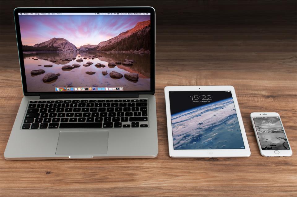
People visit websites on phones, tablets, laptops and large monitors, in portrait and landscape. Responsive design means building one page that adapts its layout to whatever space it has. In India especially, most visitors arrive on a mobile phone, so a page that only works on a desktop loses most of its audience.
The three ingredients of CSS responsive design
Responsive design rests on three ideas that you have partly met already:
- Fluid layouts: widths in percentages,
frunits and flexible boxes instead of fixed pixel widths. Flexbox and Grid do much of this work for you. - Flexible media: images and videos that shrink to fit their container.
- Media queries: CSS that applies only when certain conditions are true, such as the screen being wider than 768px.
Start with the viewport meta tag
Phone browsers assume a page was designed for desktops and zoom out to show it, which makes text tiny. This line in the <head> tells them to use the real device width instead. Without it, your media queries will not behave as expected on phones:
<meta name="viewport" content="width=device-width, initial-scale=1">
Every example in these lessons includes it. You can read more about head tags in HTML Head, Meta and SEO.
Media queries, mobile first
A media query wraps rules in a condition: @media (width >= 768px) { … }. The rules inside apply only when the viewport is at least 768px wide. This modern range syntax is supported in all current browsers; older code writes the same thing as (min-width: 768px).
The mobile-first approach writes the base styles for small screens first, with no media query, then adds queries with >= to enhance the layout as space grows. Base styles are usually simpler (a single column), so the CSS stays shorter, and phones do not have to undo desktop styles.
<!DOCTYPE html>
<html lang="en">
<head>
<meta charset="utf-8">
<meta name="viewport" content="width=device-width, initial-scale=1">
<title>Mobile-first layout with media queries</title>
<style>
*, *::before, *::after { box-sizing: border-box; }
body { font-family: system-ui, sans-serif; margin: 0; }

/* Base: small screens, one column */
.layout {
  display: grid;
  gap: 16px;
  padding: 16px;
}
.box { background: #e7f5ff; padding: 20px; border-radius: 8px; }
nav { background: #1864ab; color: white; }

/* Tablets and up: two columns */
@media (width >= 600px) {
  .layout { grid-template-columns: 1fr 1fr; }
  nav { grid-column: 1 / -1; }
}

/* Laptops and up: sidebar + content */
@media (width >= 900px) {
  .layout { grid-template-columns: 220px 1fr 1fr; }
  nav { grid-column: auto; grid-row: span 2; }
}
</style>
</head>
<body>
<div class="layout">
  <nav class="box">Menu</nav>
  <div class="box">Hotels in Puducherry</div>
  <div class="box">Things to do</div>
  <div class="box">Local food</div>
  <div class="box">Getting there</div>
</div>
<p style="padding: 0 16px;">Resize the preview to see the layout change at 600px and 900px.</p>
</body>
</html>
Choosing breakpoints
A breakpoint is a width where the layout changes. Do not chase device sizes such as “iPhone width”; there are thousands of devices. Instead, start narrow, widen the browser slowly, and add a breakpoint where the design starts to look stretched or cramped. Many sites end up with two or three breakpoints. The blog post Responsive Design Breakpoints covers this in more detail.
| Query | Applies when |
|---|---|
@media (width >= 600px) | The viewport is 600px wide or more |
@media (400px <= width < 900px) | The viewport is between 400px and 899px |
@media (orientation: landscape) | The viewport is wider than it is tall |
@media (hover: hover) | The main input can hover, such as a mouse |
@media (prefers-color-scheme: dark) | The user has chosen a dark theme |
@media print | The page is being printed |
Flexible images
An image wider than its container breaks a mobile layout by causing sideways scrolling. Two lines fix this for every image on the site: img { max-width: 100%; height: auto; }. The image can shrink but never grows beyond its natural size, and height: auto keeps its proportions. For different image files at different sizes, use the HTML srcset attribute covered in HTML Images.
Container queries
Media queries look at the whole viewport, but a card might sit in a wide main column on one page and a narrow sidebar on another. Container queries, supported in all major browsers since 2023, let a component respond to the size of its own container. You mark a parent with container-type: inline-size, then write @container (width >= 400px) { … }.
<!DOCTYPE html>
<html lang="en">
<head>
<meta charset="utf-8">
<meta name="viewport" content="width=device-width, initial-scale=1">
<title>A card that responds to its container</title>
<style>
*, *::before, *::after { box-sizing: border-box; }
body { font-family: system-ui, sans-serif; padding: 16px; display: grid; gap: 16px; }

img, .photo { max-width: 100%; height: auto; }

.wrapper { container-type: inline-size; border: 1px dashed #adb5bd; padding: 8px; }
.narrow  { max-width: 300px; }

.card { display: grid; gap: 12px; }
.photo { aspect-ratio: 16 / 9; background: #ffc9c9; border-radius: 6px; }

@container (width >= 400px) {
  .card { grid-template-columns: 160px 1fr; align-items: center; }
}
</style>
</head>
<body>
<div class="wrapper">
  <div class="card"><div class="photo"></div><p>Wide container: image beside text.</p></div>
</div>
<div class="wrapper narrow">
  <div class="card"><div class="photo"></div><p>Narrow container: image above text.</p></div>
</div>
</body>
</html>
Tip: Media queries are still right for page-level decisions such as the main layout. Use container queries for reusable components like cards, which may be placed anywhere.
Watch out: Do not hide important content on mobile with display: none just because it is hard to fit. Mobile users need the same information. Rearrange it, collapse it into an accordion or simplify it instead. Also check that tap targets such as buttons are large enough, around 44 by 44 CSS pixels.
CSS responsive design also depends on flexible sizes for text and spacing. The next lesson, CSS Units, shows how rem, viewport units and clamp() make type and spacing scale smoothly.