Microcopy is the small text inside an interface: button labels, form hints, error messages, empty-state text, tooltips and confirmation dialogs. Each piece is only a few words long, but together they decide whether people understand what to do next. A beautiful screen with the label “Submit” and the error “Invalid input” still leaves users guessing.
UX writing is not about being clever. It is about being clear, specific and helpful at the exact moment someone needs it. This guide gives you rules you can apply today, with before-and-after examples, and a checklist to review your own screens. It draws on guidance from the Nielsen Norman Group and on everyday design practice.
Four UX writing principles behind good microcopy
- Clear before clever. Jokes and wordplay can confuse people, especially those reading in a second language. Use plain words.
- Specific before generic. “Save address” tells people what will happen; “OK” does not.
- Short, but complete. Remove filler words, but never remove the information people need to act.
- Consistent everywhere. If it is “Cart” on one screen, it should not be “Basket” on another. Keep a small word list for your product.
These connect directly to Nielsen’s usability heuristics, especially “match between the system and the real world” and “help users recognise, diagnose and recover from errors”. Read our guide to Nielsen’s 10 heuristics for the background.
Buttons and links
A button label should describe the action and, ideally, its result. People often read only the button, not the paragraph above it, so the label must make sense on its own.
| Instead of | Write | Why |
|---|---|---|
| Submit | Send message | Says what happens |
| OK | Delete 3 photos | Confirms exactly what will be affected |
| Click here | Download the brochure (PDF, 2 MB) | Works out of context and for screen-reader users who list links |
| Continue | Continue to payment | Tells people where they are going |
| Yes / No | Discard changes / Keep editing | No need to reread the question |
- Start with a verb: “Book”, “Save”, “Add”, “Download”.
- Use sentence case (“Add to cart”) unless your design system says otherwise. It is easier to read than ALL CAPS.
- Keep the label the same throughout a flow. If the button says “Place order”, the confirmation should say “Order placed”, not “Purchase complete”.
- Avoid vague links like “Read more” repeated many times on a page. Each link’s text should make sense alone.
Form labels, hints and placeholders
Labels tell people what to enter. Hints explain the format or why you need it. Both should be visible before people start typing.
| Element | Good example | Tip |
|---|---|---|
| Label | Mobile number | A short noun phrase; no colon or capitals needed |
| Hint | We’ll send your booking confirmation by SMS | Explains why you ask, which builds trust |
| Format hint | Date of birth – for example 15 08 1995 | Show the format before the error, not after |
| Optional field | Company name (optional) | Mark the exceptions, not every required field |
Watch out: Do not use placeholder text instead of a label. It disappears when people start typing, often has low contrast, and screen readers may not announce it reliably. Keep the label visible.
In code, every input needs a real <label>. See HTML Forms and HTML form best practices.
Error messages
Errors are where microcopy matters most, because the user is already stuck. Nielsen Norman Group’s error-message guidelines can be summarised in three parts: make the error visible near where it happened, communicate it in plain language without blaming the user, and make recovery efficient by keeping what the user entered and suggesting a fix.
A good error message answers two questions: what went wrong? and what can I do now?
| Weak | Better |
|---|---|
| Invalid input | Enter a 10-digit mobile number, for example 98765 43210 |
| Error 403 | You don’t have permission to view this page. Ask your team admin for access. |
| Password does not meet requirements | Use at least 8 characters, including a number |
| Something went wrong | We couldn’t save your changes because the connection dropped. Check your internet and try again – your text is still here. |
| Illegal date | Check-out must be after check-in |
Rules for errors
- Put the message next to the field, and also summarise multiple errors at the top of long forms.
- Avoid words that blame: “invalid”, “illegal”, “wrong”, “you failed to”.
- Do not show technical codes alone. If support needs a code, add it after the plain explanation.
- Do not rely on red colour alone; add an icon and text so colour-blind users notice.
- Do not show errors while someone is still typing the first characters. Validate when they leave the field or submit.
- Never clear what the user typed because of one mistake.
Empty states
An empty state is what people see when there is nothing to show yet: no orders, no messages, no search results. A blank area makes people wonder whether the page is broken or still loading. NN/g recommends that empty states communicate system status, teach something useful and offer a direct path to the main task.
| Situation | Weak | Better |
|---|---|---|
| First use | No data | You haven’t saved any trips yet. Tap the heart on any tour to save it here. [Browse tours] |
| No search results | 0 results | No results for “kodaikanal hotels under 1000”. Try fewer words or check the spelling. [Clear filters] |
| Everything done | Empty | All caught up. New messages from your guide will appear here. |
| Filter too strict | Nothing found | No bookings between 1 and 5 March. [Show all bookings] |
Notice the pattern: say what is happening, say why it might be empty, and give one clear next step.
Confirmations and destructive actions
Confirmation dialogs interrupt people, so use them only for actions that are hard to undo. When you do use one, the title and buttons should carry the meaning without the body text.
- Title as a question that names the object: “Delete the folder ‘Pondicherry trip’?”
- Body explains the consequence: “The 24 photos inside will be deleted too. You can’t undo this.”
- Buttons repeat the action: “Delete folder” and “Cancel”, not “Yes” and “No”.
- For reversible actions, skip the dialog and offer Undo in a short message instead: “Message archived. Undo”.
Success messages, loading and notifications
- Success: confirm the specific result and the next step. “Booking confirmed. We’ve emailed the details to [email protected].”
- Loading: tell people what is happening if it takes more than a moment: “Checking seat availability…”.
- Notifications: lead with the useful part. “Your train leaves in 2 hours from platform 3” beats “Reminder from TravelApp”.
- Permissions: explain the benefit before the system prompt: “Allow location to see bike rentals near you.”
Voice and tone
In UX writing, voice is your product’s personality and stays the same. Tone adapts to the situation. A friendly travel app can be cheerful on a success screen, but should be calm and direct when a payment fails. Write in second person (“your booking”), use active voice (“We sent you a code” rather than “A code has been sent”), and use contractions such as “we’ll” and “can’t” if your brand is informal.
Tip: If your product serves people in several languages, write short, simple sentences without idioms. They translate better, and many users read English as a second language.
Accessibility and microcopy
- Icon-only buttons need an accessible name, for example
aria-label="Close"in code. - Link text must make sense out of context.
- Error messages must be connected to their fields so screen readers announce them.
- Avoid directional instructions such as “click the button on the right”; layouts change on mobile.
See web accessibility basics for the WCAG rules behind these.
Writing microcopy in Figma
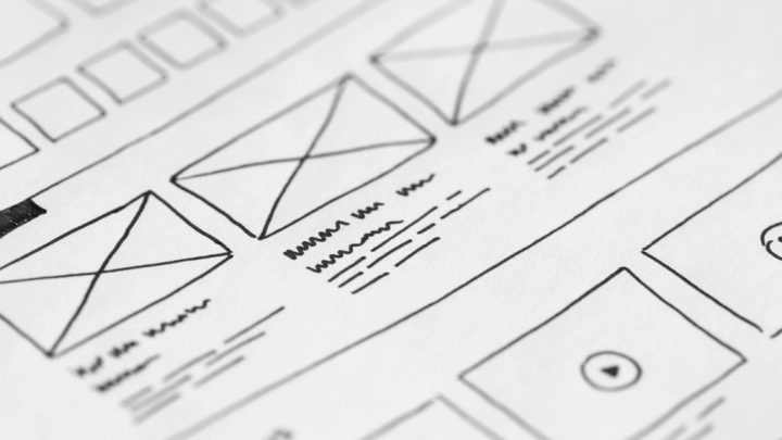
Do not design with lorem ipsum and “Button” labels. Real words change layouts: “Continue to payment” is much longer than “Next”. Write draft copy directly in your wireframes, use text properties in your Figma components so copy is easy to change, and test long text and other languages before handoff. Then check the words in usability testing: if people hesitate over a label, rewrite it.
Microcopy review checklist
- Every button starts with a verb and says what will happen.
- No generic labels: Submit, OK, Click here, Read more.
- Every input has a visible label; hints appear before errors.
- Each error says what went wrong and how to fix it, without blame or jargon.
- Every list, table and search has a designed empty state with a next step.
- Destructive dialogs name the object and repeat the action on the button.
- The same thing has the same name everywhere.
- Copy has been read aloud and tested with real users.
Frequently asked questions
What is microcopy in UX?
Microcopy is the short text in an interface, such as button labels, form labels and hints, error messages, empty states, tooltips and confirmations. It guides people through tasks at the moment they need help.
What is the difference between UX writing and copywriting?
Copywriting mainly aims to persuade, for example in ads or landing pages. UX writing aims to help people use a product: understand options, complete tasks and recover from problems. Both need clear writing, but their goals differ.
How do you write a good error message?
Show it near the problem, explain in plain language what went wrong, suggest how to fix it, avoid blaming the user and keep the information they already entered.
Should button labels be one word?
Not necessarily. A short verb phrase such as Save address or Continue to payment is clearer than a single generic word. Keep labels concise, but make sure they describe the action.
Who writes microcopy in a small team?
Often the UI/UX designer writes the first draft while designing, then reviews it with product, development and support colleagues. Larger teams may have dedicated UX writers or content designers.